
Unity is crucial in achieving great design. Whether the design is an illustration, painting, advert, poster, web site, Brand style guide, product, service or system. This is not a new idea, though it might be rediscovered every subsequent generation by new sets of creatives. Looking back at yesterday's artists, giants of their craft, it is amazing to see these universal principles at work in all of their work. In part 3 of Exploring UNITY, I am going to be writing about examples of some of my favourite artists to show these principles in 'the wild'.
In Part 2 I'm writing about leveraging other formal principles to achieve design Unity. I once gave a presentation on this subject. Participants' reactions to my talk deeply impressed me. It struck me how most people don't understand that design and art is a structured and conscious process. They were amazed to see how clear it was to see that artists, back through the ages, were manipulating these concepts to create masterful work.
So here are the formal principles of Design which we can manipulate to create unity in our work:
1. Emphasis
This principle is about creating a clear visual hierarchy organised around the concept of Emphasis. This means that we work to create an arrangement of all elements according to the principle of emphasis. There are many different ways to create emphasis - it is not a formulaic principle. Clear thought needs to be given to the message of the design or the purpose of it. To make sure that the emphasis is adding to the overall impact of the core message. Here are some ways of manipulating emphasis in a design.
a. Emphasis by Isolation: Moving an element away from other elements can make that element become more of a focus point.
b. Emphasis by Placement: Careful thought to how we place an element in contrast to other elements will create emphasis.
c. Emphasis through Scale: Larger, smaller? Scale is hugely important in establishing a focal point.
d. Emphasis through Contrast. Contrast creates visual tension which pulls human eyes towards it.
e. Emphasis through direction and pointers. At times the artist or designer uses other elements to lead the eye towards the point of emphasis.
Emphasis, like all these principles, doesn't work in an isolated manner. There is a dynamic relationship between all the parts. Unity is achieved if a design is seen as a whole even though it's made up of many different parts or just a few. At times it is important to understand that emphasis is not just one element working by itself. There is often a 'read' of elements that lead to the point of emphasis or because elements are grouped and one is not so that there is emphasis.
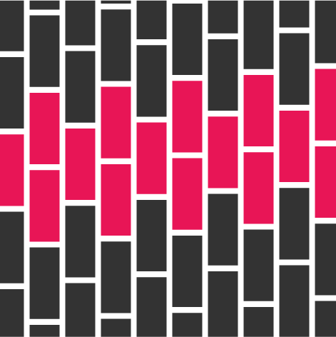
This principle has a mirror function. Repetition can be related to rhythm, repetition of visual elements with consistency creates a pattern. Pattern can create rhythm. Element 1, element 2, element 1, element 2. Breaking this pattern will create Emphasis. This is the mirror function, creating a pattern to break it. It is called variation. Variation breaks the pattern created by repetition creating visual interest.
4. Variety
Variety is hugely important. Variation of brush strokes, of pencil marks. Variation of shape. variation of movement and patterns. Variation creates visual interest. Every space within the Unity - the whole needs to be activated. "Empty space" can be activated in contrast or balance. Not every space needs to be 'filled', but there needs to be variety in design.
5. Balance
Balance is about visual weight. Every element needs the balancing of its visual weight. Every element in a composition carries energy. It has "push" and "pull". Don't forget the boundaries and how visual weight reacts to boundaries. Notice the gravity between a boundary and an element or different elements.
6. Economy
This principle is often overlooked or under-used. Economy is crucial. Not every element should be overly detailed or complex. There need to be areas of simplicity to rest the eye and areas of complexity to generate more cognitive load. The human eye doesn't work the same as a photograph. The human eye focuses in a cone shape with a central focal point. When everything is complex the effect is disturbing. In a design, we lead the eye or attention of a person with the use of economy. Complexity and simplicity. These are the principles that will take our designs to new heights. Learning to use these elements consciously in a design, whether the design is an illustration, painting, advert, poster, web site, Brand style guide, product, service or system takes practice and a willingness to make mistakes on the way.
Unity
Unity is a rare creature. A moment of connection when these principles used on elements create a cohesive whole. When unified, all graphic elements look as though they belong together. Each part relates to the whole and the whole relates to its parts. Unity is one of the primary goals of composition - composing an integrated whole, not unrelated parts sounds easy but it takes humility and practice.